
Wuu design system
Wuu uses soft neutral window chrome around an opaque reading canvas: off-white (#fcfcfd) in light mode, charcoal in dark mode. Regular system typography, clear gray selections, rounded controls and gentle shadows make long conversations and frequent actions easy to read. Settings and extension pages use grouped cards on a secondary canvas. Optional shell skins remain independent of the content theme.
This specification and its visual boards maintain the desktop foundations for designers, developers, and coding agents. They are not a reskin proposal or a claim that every existing screen already conforms. Native phone interfaces share the information and interaction principles, not literal desktop pixel dimensions.
Visual boards
Section titled “Visual boards”The boards cover color, space/radius/elevation, and typography using Wuu’s own variables, not the palette or fonts of external references. Each has light and dark high-resolution PNG versions, with bilingual labels in one shared asset set.
| Board | Light | Dark |
|---|---|---|
| Color | Full image | Full image |
| Space, radius, elevation | Full image | Full image |
| Typography | Full image | Full image |
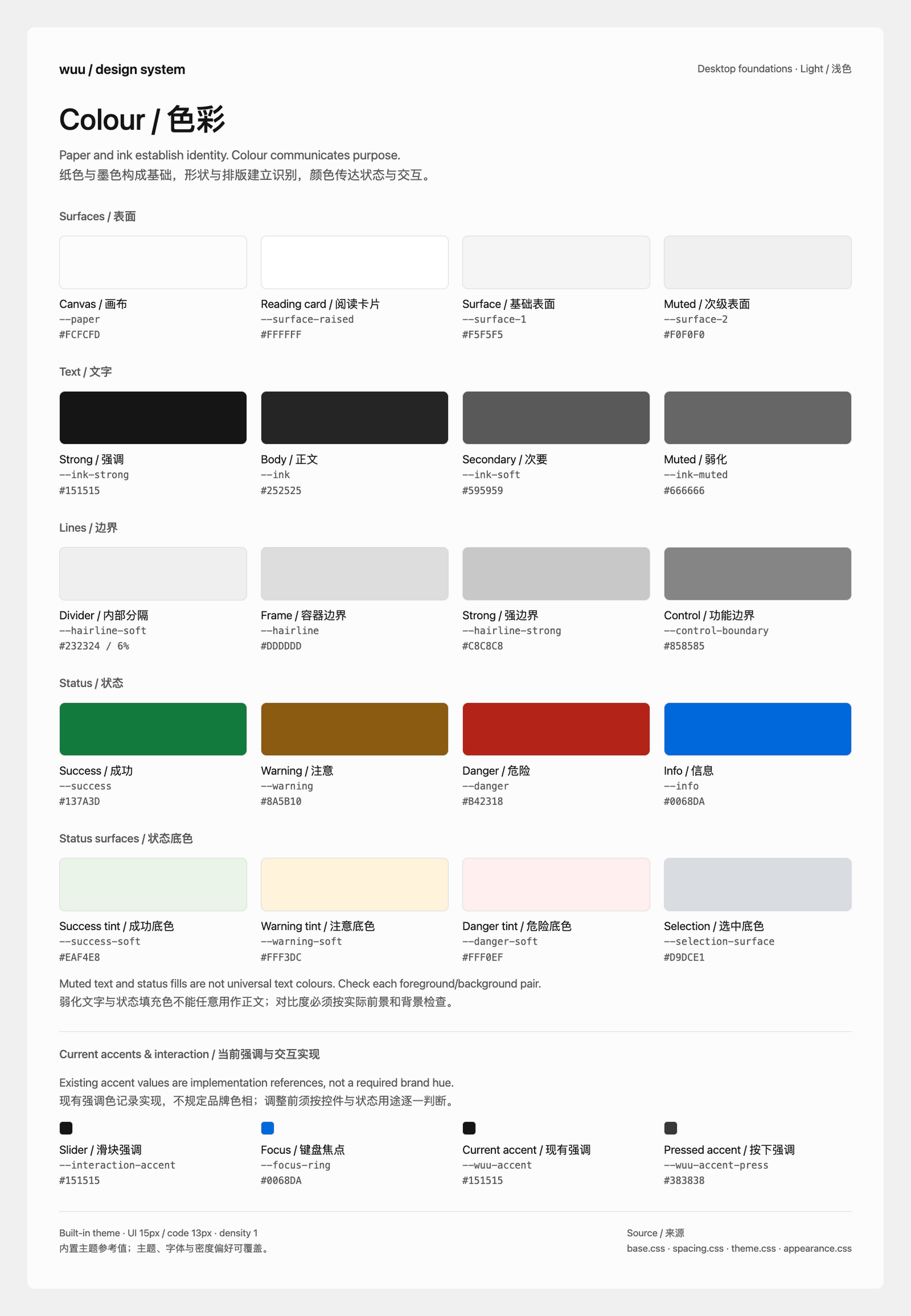
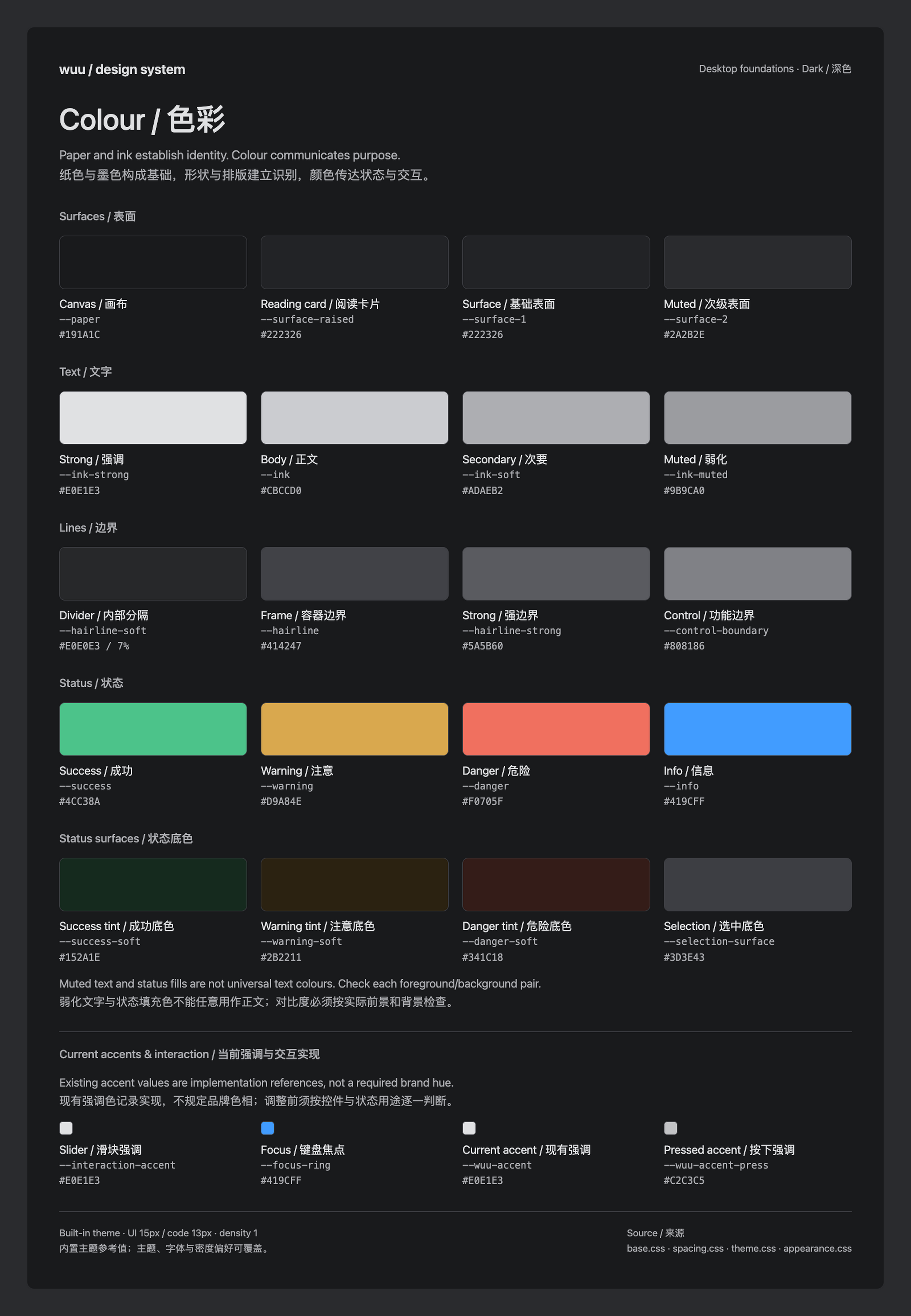
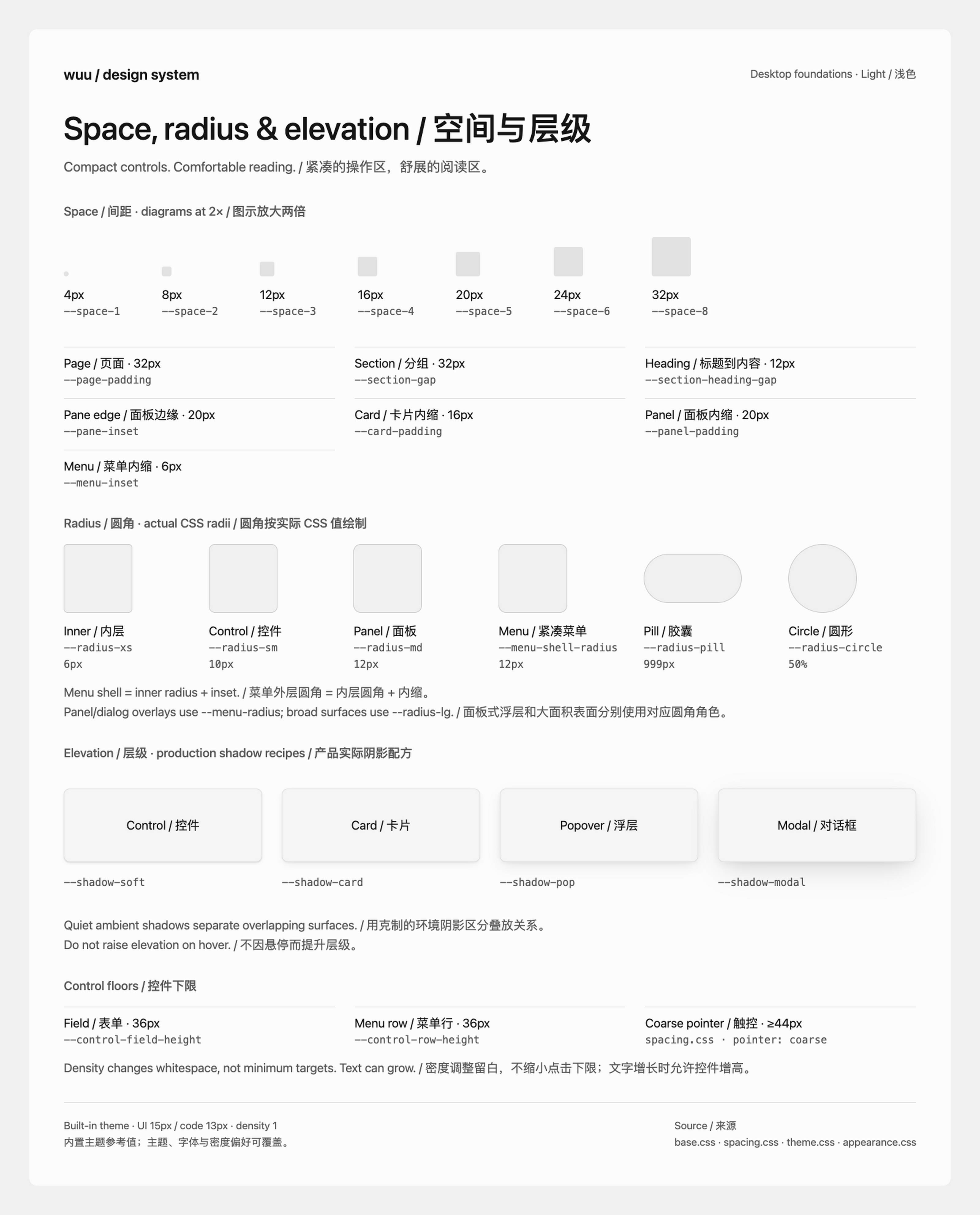
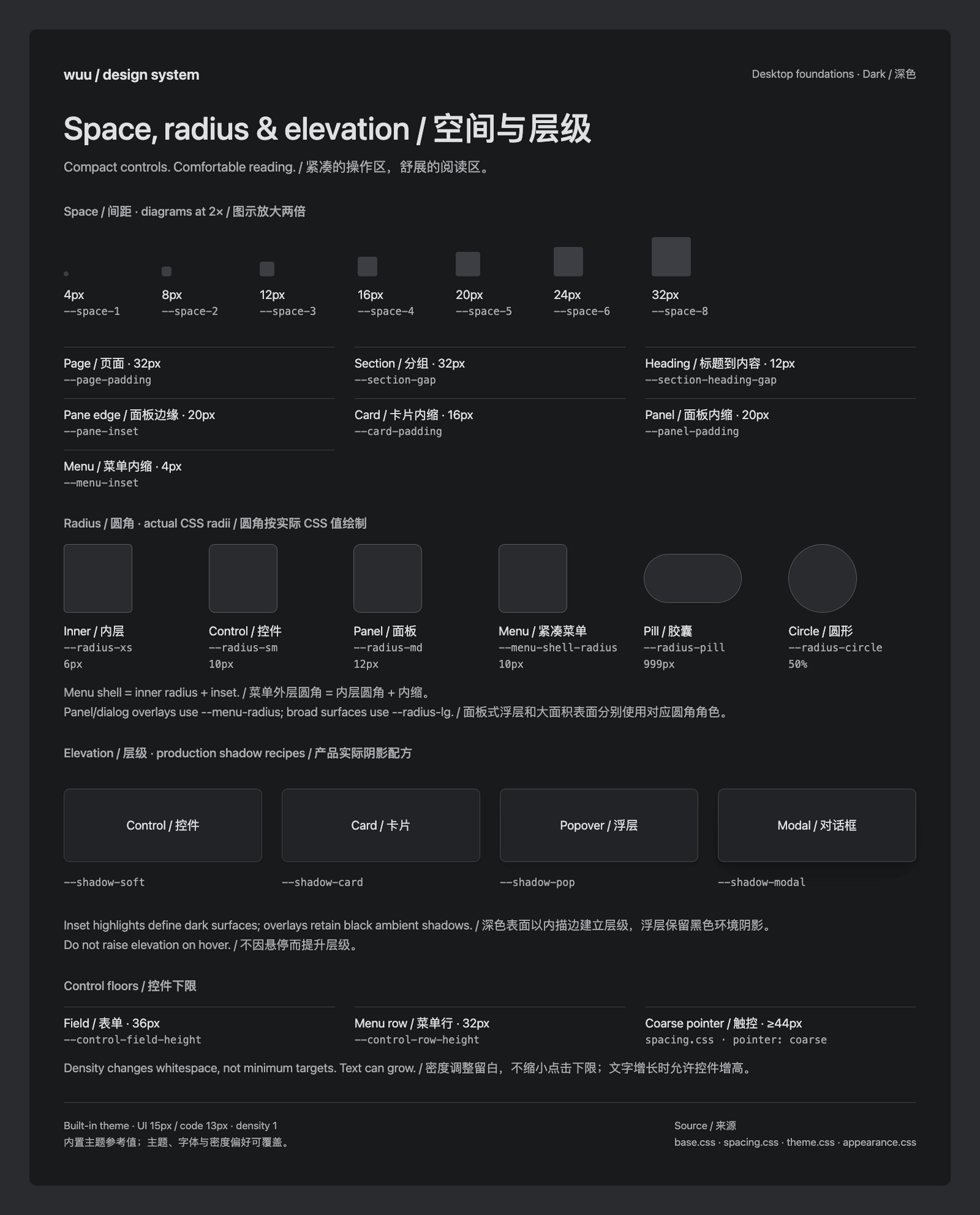
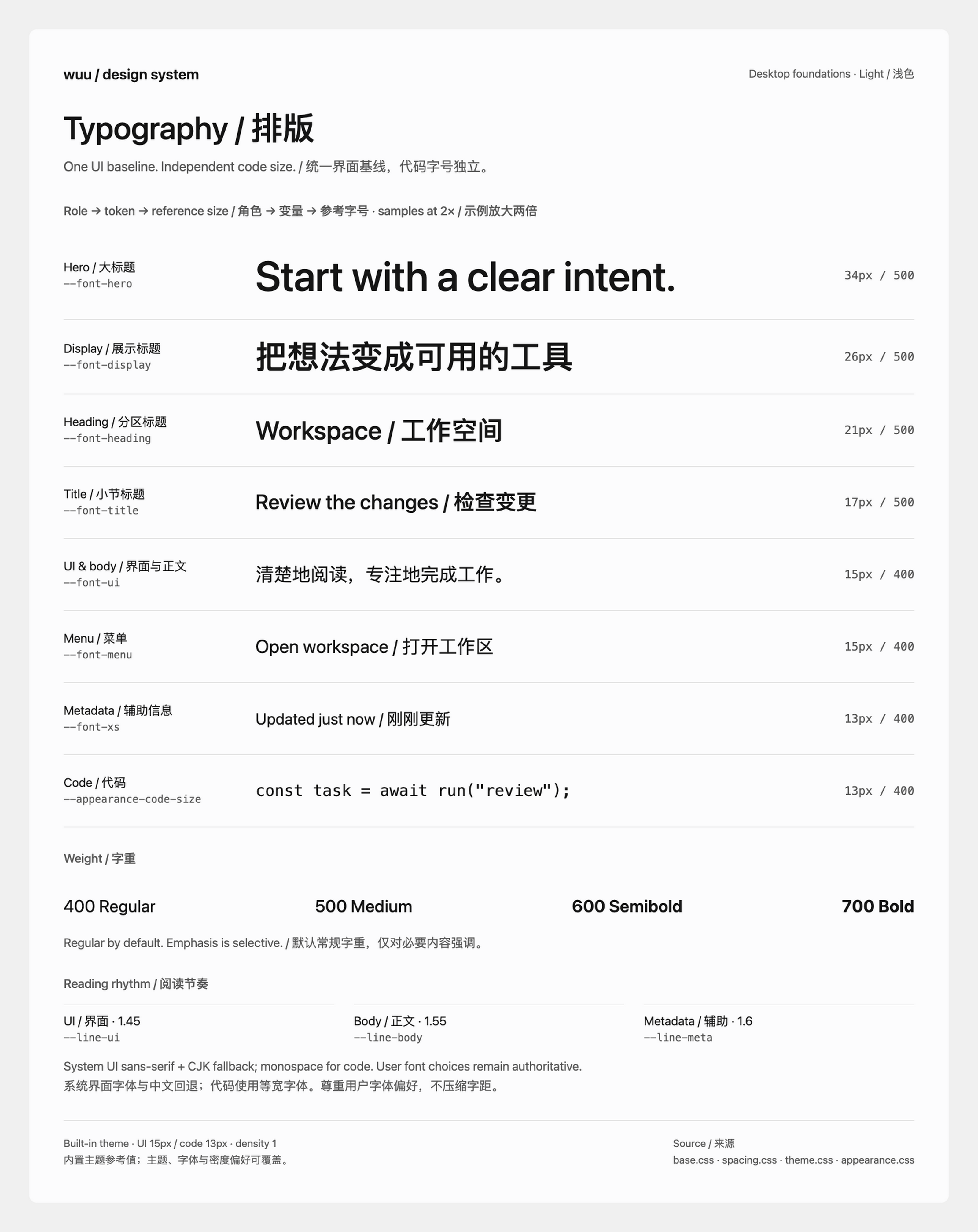
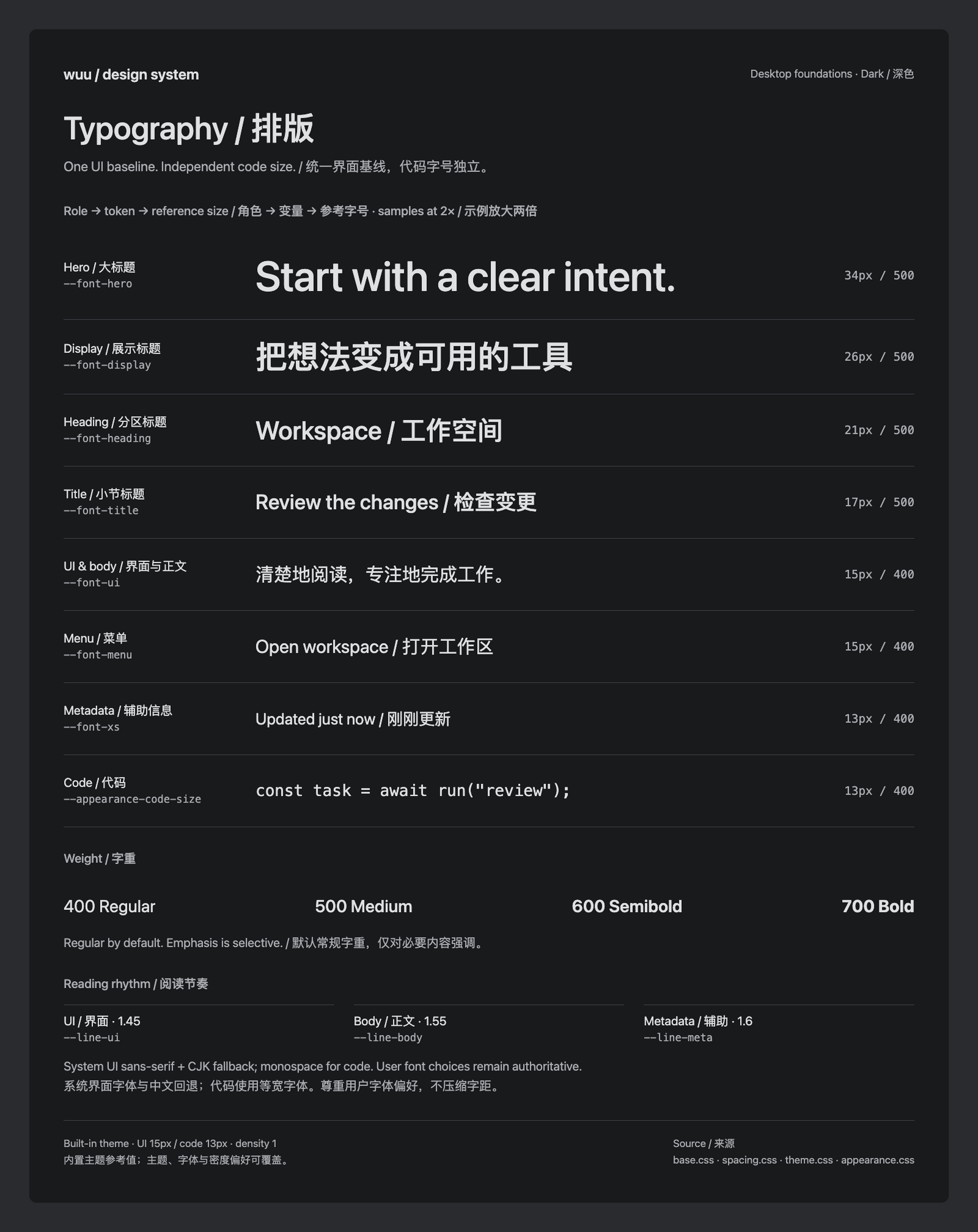
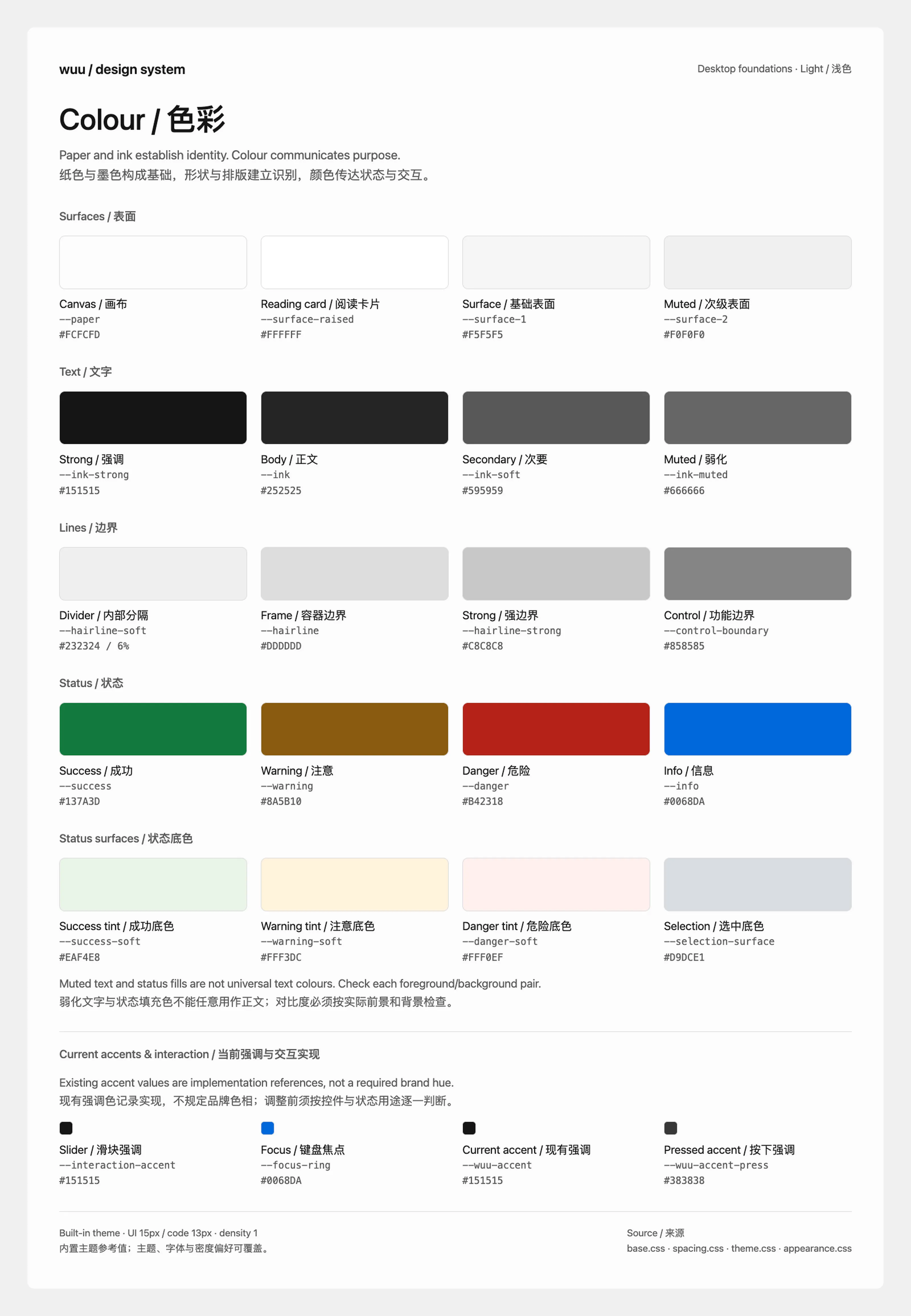
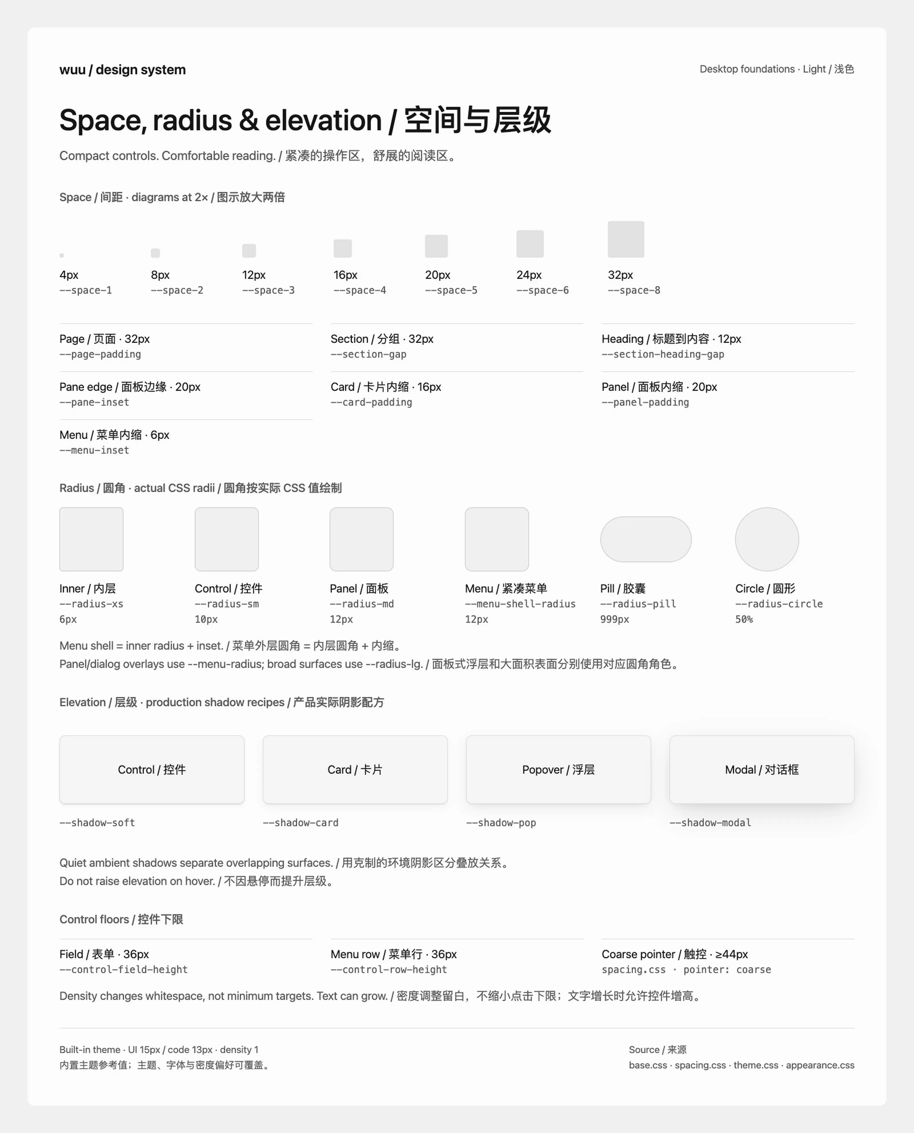
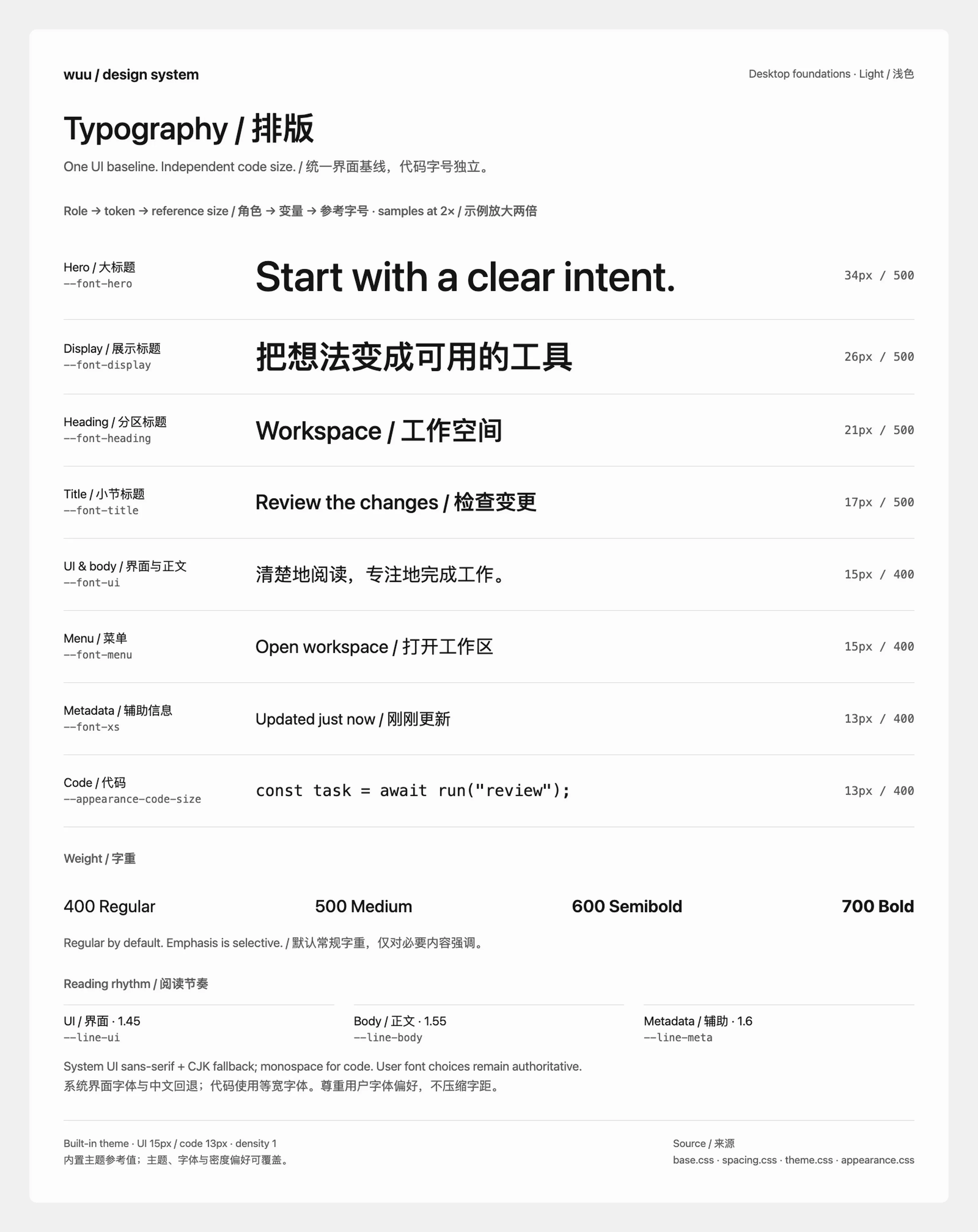
Boards show built-in themes at standard density with current default font settings. Colors come from browser-computed values; translucent colors include their opacity and must be understood against their background. Type samples and spacing blocks are enlarged 2× for inspection; labels show actual CSS dimensions, not image pixels. The board’s own headings, margins, and canvas are not product tokens.
Specification and implementation
Section titled “Specification and implementation”Use roles rather than copying numbers from images. A token is a named design value with a purpose: --ink-soft, for example, means secondary text. Components consume it through var(...). Themes and preferences may change its resolved value without changing that purpose.
| Source | Responsibility |
|---|---|
| base.css | Color roles, light defaults, radius, elevation, weight, and motion |
| theme.css | Dark overrides, including text, surfaces, and shadow recipes |
| spacing.css | Spacing roles, density boundaries, narrow-screen insets, and touch floors |
| appearance.css | Effective UI type ratios, independent code size, and icon sizes |
| AppearancePreferences.ts, protocol | Font preferences, sizes, and runtime defaults |
| Shared components and previews | Control behavior, keyboard interaction, real states, and acceptance entry points |
These are internal renderer roles, not all public API promises. Extensions use the public theme contract, not arbitrary internal variables. Documentation explains purpose, code defines values, and boards are regenerable views of the code. When they disagree, inspect the actual cascade and preferences before updating all affected representations; do not just edit a label on an image.
Product defaults
Section titled “Product defaults”Offer complete choices rather than visual tuning controls. Users choose a shell skin (with a local image when that skin shows one), content theme, light/dark mode and readable fonts. Hide the content-theme chooser when no alternative is installed. Blur, image strength, crop position, materials, corners and shadows are product decisions. Existing saved pictures adopt the current treatment. Accessibility preferences remain independent.
Identity and emphasis
Section titled “Identity and emphasis”Wuu’s identity is monochrome-first, with paper, ink, and neutral surfaces rather than a mandatory signature hue. The black-and-white app icon, consistent shapes, typography, and space provide recognition. Neutral does not mean a flat gray interface: use readable tonal contrast and clear hierarchy, with light and dark themes expressing the same roles.
The outer frame and compact or expanded ribbon share one continuous skin. The rounded inner canvas remains opaque by default: navigation, conversation, and workspace share #fcfcfd in light mode and charcoal in dark mode. A shell skin may instead place artwork in the canvas — the sidebar and the conversation share one veil in every state, other destinations pick how much artwork shows through that veil layer, and floating panels use the host glass material. Keep these large adjacent regions continuous; raised content and inset groups provide the tonal hierarchy. Content navigation uses neutral filled selections with regular-weight labels. Skin colors and artwork stay outside the content theme; custom themes retain their public color and control overrides.
The light surface palette uses a subtly cool canvas and neutral supporting steps: #fcfcfd paper (--paper, backed by --gray-25), #ffffff raised reading surfaces (--surface-raised), #f5f5f5 secondary surfaces, and #151515 strong text. Dark mode uses #191a1c paper with progressively lighter charcoal surfaces and #e0e1e3 strong text. It stops short of white: body text resolves near #cbccd0 and secondary text near #adaeb2, so light glyphs do not bloom on the charcoal canvas or flatten the hierarchy. The slightly cool #d9dce1 light selection is a separate role, so navigation remains distinct without tinting the reading canvas.
Local wallpaper is artwork, not a skin: the default frame and skins that accept it show it in place of their own. Each placement has one product treatment. In the frame, it is a centered cover with Gaussian blur and automatic light/dark contrast correction. In the canvas, it stays sharp with a looser brightness bound, and any cell screen comes from the skin. Preserve source color wherever it already supports readable text. Process the image in a worker and share the frame raster with native ribbon surfaces. Plugin skins supply their finished artwork and foreground pairs. The default frame works without any image.
Selection in the rail is the only location signal, and the label keeps its regular weight; both themes use a clearly filled row against the rail. Tool-picker rows stay unfilled until hovered or pressed. The user’s own message and conversation composer share the raised reading surface. Messages use a fine edge and the short --shadow-soft elevation; the composer keeps its own --shadow-composer role. Full-width message cards and their inline editors use the shared panel radius. This keeps sent prompts distinct without a solid gray band; theme overrides still control the message background, border, shadow, and radius. Code in an answer is an inset one tonal step from the canvas without a frame; a border on top of the fill would draw the same boundary twice. Inline code takes the same step as a small chip in answers and user messages alike, so an identifier stays findable in CJK prose, where a bare monospace run reads as a font fallback. A tool row keeps its verb in --ink-tertiary and draws its target (file, query, or command) halfway between that and body ink, so a run of rows scans by what was touched without competing with the answer.
Brand identity, action emphasis, and status are separate concerns. Primary actions can use strong foreground/background contrast without a saturated brand fill. Links, keyboard focus, and selection need recognizable interaction cues; success, warning, and danger need distinct meanings. Color supports these purposes rather than decorating every heading or selected item. Never rely on color alone for an essential distinction.
Shared materials
Section titled “Shared materials”Fields keep a stable paper fill. Secondary buttons use --control-secondary-bg with a light control shadow; hover uses --control-secondary-hover-bg. Menus, tooltips and floating panels share --menu-bg, a nearly opaque --surface-floating and --surface-blur. Content cards and reading surfaces stay opaque. Ghost and icon actions remain unboxed until interaction. Host and extension controls use the same roles.
Color roles
Section titled “Color roles”| Role | Variables | Use |
|---|---|---|
| Canvas and surfaces | --paper, --surface-raised, --surface-1 through --surface-4 | Reading canvas, raised message/composer surfaces, secondary and emphasized surfaces; surface numbers are not shadow levels |
| Text | --ink-strong, --ink, --ink-soft | Important content, body, secondary descriptions; keep body text readable and normally weighted |
| Quieter text | --ink-tertiary, --ink-muted, --ink-faint | --ink-tertiary is the quietest ink for words and stays above 4.5:1; --ink-muted is for icons, chevrons, and disabled marks, and --ink-faint for marks that carry no information; low contrast must not conceal crowding |
| Placeholder | --placeholder-ink | Example text in fields, set once on ::placeholder so no field picks its own; distinct from entered text and labels, above 4.5:1 |
| Three line tiers | --hairline-soft, --hairline, --hairline-strong | Within-surface separators, independent frames, stronger control boundaries; no local gray per line |
| Functional boundary and focus | --control-boundary, --focus-ring | Identify controls and keyboard focus, distinct from decorative separators |
| Selection | --selection-surface | A clear selection surface, not a borrowed warning or success color |
| Status | --success, --warning, --danger, --info | Success, caution, danger, information; combine with text or icons, never color alone. Diff additions and deletions in every surface draw from --success and --danger |
Success, warning, and danger tints are --success-soft, --warning-soft, and --danger-soft. Status colors are not general-purpose body colors or automatically readable on arbitrary fills. Use appropriate content roles such as --ink-on-accent on colored surfaces, then check the actual pair. Dark mode adjusts surfaces, text, and status independently rather than inverting light colors.
Current implementation accents
Section titled “Current implementation accents”The renderer defaults to neutral emphasis: --wuu-accent follows the theme’s strong text color (dark in light mode, light in dark mode), and --wuu-accent-press mixes it toward the canvas. Sliders use the same accent through --interaction-accent. Extension themes can still override the public accent, pressed, and on-accent tokens.
--info and the focus ring share one blue: the macOS link color, which is the platform’s own text-safe blue (at least 4.5:1 on the canvas and on the user bubble in both themes). It is the interaction hue of the default content interface; shell artwork may carry its own palette.
Links in rendered Markdown (answers, user messages, and file previews) use the blue information role with a subtle underline; hover strengthens the underline. The color and underline make links recognizable within prose. A link’s file, site, or favicon mark sits in --ink-muted with a small gap before the label, and the underline never runs under it. Themes can still color links through --wuu-color-link.
Keep status semantics separate from emphasis. TODO progress uses text colors and distinct marks, while high context usage uses warning color. Success, warning, danger, and focus retain their semantic colors rather than becoming neutral merely because the accent is neutral.
Typography
Section titled “Typography”Use the system UI font with CJK fallback and respect user font choices. The content font defaults to the UI family and can be overridden for messages, drafts, and Markdown previews without changing navigation or controls. Code, editors, and diffs retain independent monospace typography rather than scaling mechanically with UI text. Avoid unrelated typefaces for headings, prose, and numbers; use tabular numbers or monospace where numerical alignment requires them.
The current runtime defaults are 15px UI and 13px code. Ratios in appearance.css use 14 as their denominator: 14px is the proportional reference, not the current startup default. Valid saved preferences remain authoritative and must not be reset to the documented defaults.
| Role | Variables | Relationship to UI size U | Value at U = 15px |
|---|---|---|---|
| Hero | --font-hero | round(U × 32 / 14) | 34px |
| Display | --font-display | round(U × 24 / 14) | 26px |
| Heading | --font-heading | round(U × 20 / 14) | 21px |
| Title | --font-title | round(U × 16 / 14) | 17px |
| UI and body | --font-ui, --font-body, --font-content | U | 15px |
| Menus | --font-menu | U | 15px |
| Compact text | --font-sm | round(U × 13 / 14) | 14px |
| Metadata | --font-xs | max(12px, round(U × 12 / 14)) | 13px |
| Code | --appearance-code-size | Independent preference | 13px |
Derived roles round to whole pixels. The saved UI size may be a half step, but fractional derived sizes would put line boxes and 1px edges between device pixels.
Use 400 for ordinary text and menu items, and 500 or 600 selectively for headings and emphasis. Reserve 700 for occasional strong emphasis. Message emphasis uses 600. On macOS, system font smoothing is the default; grayscale is an optional appearance preference. Inspect both themes at regular weight before increasing emphasis. Base line-height roles are 1.45 for UI, 1.55 for body, and 1.6 for metadata; individual reading surfaces may have semantic overrides, not one forced line height for every component. Conversation reading and process leading are whole-pixel lengths derived from the message size (both 1.6, rounded to 2px), so stacked rows and cards share edges. Composer drafts use the same reading leading as sent queries and answers, so text keeps its rhythm when it is sent. Message headings step to 1.5, 1.25, and 1.1 times the body size, rounded to whole pixels, so hierarchy does not rest on weight alone. At the default size, conversation text is 15px/24px with a 16px paragraph gap. Paragraph gaps use the shared one-em spacing role, snapped to the module described below. Fenced code, hover diffs, and code editors share the independent code size with 1.5 leading rounded to 1px, giving 13px/20px by default. Inline code remains 0.92 times the surrounding prose size. Preserve natural letter spacing instead of shrinking type or tightening tracking to repair layout.
The latest active process label uses a quiet, theme-relative tone with a highlight that sweeps for one second in each four-second cycle, after an initial 600ms delay. The base text stays visible beneath the decorative highlight. Once a summary is no longer active, it uses steady --ink-tertiary text. Reduced motion, background conversations, and stream-following suppress the highlight; result prose keeps its normal contrast.
Spacing and layout
Section titled “Spacing and layout”The spacing module is one quarter of the saved UI font size, rounded to a whole pixel and multiplied by density to form --space-1. At the default 15px size it remains 4px, giving 4, 8, 12, 16, 20, 24, 32px through --space-1/2/3/4/5/6/8; at 20px it becomes 5px. Themes may still supply an explicit --wuu-space-unit. Half, one, and two em relationships therefore share one grid instead of separate font multipliers or fixed gaps. Prefer semantic roles; account for line-box leading and control footprints when assessing visible whitespace.
| Relationship | Variables | Standard density |
|---|---|---|
| Pane edge to first and last glyph | --pane-inset | 20px |
| Page inset | --page-padding | 32px |
| Between groups, including the latest turn and the input | --section-gap | 32px |
| Heading to content | --section-heading-gap | 12px |
| Card and panel insets | --card-padding, --panel-padding | 16px, 20px |
| Compact block/inline padding | --compact-padding-block, --compact-padding-inline | 8px, 12px |
| Control block/inline padding | --control-padding-block, --control-padding-inline | 4px, 12px |
| Menu inset and item gap | --menu-inset, --menu-item-gap | 6px, 8px |
Responsive layouts retain these spacing roles while reflowing content and controls to fit the available pane. Shared fields and menu rows have a 36px floor, or 44px for coarse pointers, and round up to the 4px grid. They grow further with text and content; fixed heights must not clip text. These field and menu-row roles do not assign one size to every icon button.
In the sidebar, sibling rows use one module, headings attach to their content with two, and functional groups separate by six. The pinned append drop target owns its group break, so it does not add a second gap. In conversations, paragraphs use four modules, list items and heading-to-content gaps use two, and a new heading or turn uses eight. A process header attaches to its first detail with two modules; the final answer starts six modules after the process cluster. Message frames and the composer share the same text inset and reading leading. Settings use the three-module heading gap, four-module row padding and one-module label-to-description gap, with eight modules between sections. Settings navigation uses the shared sibling-row gap; its top margin is two modules, while six modules separate navigation groups. Connected service descriptions and catalog row gaps use one module, and catalog tiles use one module of vertical padding.
A settings section separates its heading from its body: the heading-to-body gap is three modules, while sibling content blocks inside the body use four. This keeps theme previews and background controls, or font controls and smoothing controls, related without squeezing them together. Inline forms separate their fields from commit actions by four modules. Service catalogs and subscription cards use four-module insets and block gaps; label-to-field gaps use two. Usage tables share the settings row padding, and model names, archive titles and their descriptions use the one-module detail gap. The usage table folds below 36 UI em so larger text gets the same reading room. Connected services and catalog choices share an eight-module icon slot and three-module icon-to-name gap (32px and 12px at a 4px module). Artwork scales with the UI text independently of the slot, so the extra room remains whitespace. Connected rows use an eight-module horizontal inset. The featured catalog first divides its content width into at most three equal columns, then gives every cell four-module horizontal insets; those insets own the column gutter. Each column keeps fixed icon and text starts regardless of name length or an incomplete final row. Below 39 and 26 UI em of catalog content width, it switches to two and one equal columns respectively. Both sections share the identity proportions while laying them out within their own available width; row height and secondary text express their different information density. Chart cell geometry and optical icon offsets retain their own roles.
Alignment axes
Section titled “Alignment axes”Every edge that reads as aligned must come from one shared role, not from separately tuned values that happen to be close.
- Pane inset. In chrome rows such as sidebar rows, titlebars, and tab bars, the first and last visible glyph sits
--pane-insetfrom the pane edge. The outer sidebar adds one spacing module when it meets the window edge, where square CJK glyphs have little sidebearing; when the navigation ribbon occupies that edge, its compact secondary pane keeps the base inset. Align ink, not button boxes: a control whose box is larger than its glyph subtracts its optical offset, such as--control-toolbar-glyph-offsetfor toolbar buttons. Rows that float inside a pane, in the sidebar, the workspace tabs, the file tree, the review list, and the tool list, split the inset between the list’s padding and the row’s own, so the hover fill keeps a margin from the edge while the glyph stays on the inset. - Reading column. Unframed content (paragraphs, headings, lists, process rows, answer actions) shares the column’s leading edge. Message tables have no side frame, so their outer cell text also starts on that edge.
- Framed content. Code blocks, the composer, message bubbles, and reading cards place text and icon glyphs
--card-paddingfrom the outer edge; a frame’s border is part of that measurement. A code block’s language label, its code, and the composer’s text therefore share one axis. Compact entry cards use the density roles described below. The query bubble and the composer draft keep that inset above and below their text as well: their block padding subtracts the line’s half-leading, with an 8px floor, so glyphs sit the same distance from the frame at every text size. - Accessory columns. Sidebar trailing accessories of different sizes share one center axis. Headings reserve their accessory’s footprint whether or not the section has one, so group spacing does not depend on which headings offer an action.
Align peer labels, icon columns, and trailing actions. Indentation expresses hierarchy, independent of running or unread status. Reserve the real footprint of indicators and actions plus a reading gap. Give each spacing relationship one owner rather than accumulating wrapper gaps, child margins, and invisible drag targets. Use appropriate reading-width roles such as --content-column-width, not one mandatory width for every page.
Radius and elevation
Section titled “Radius and elevation”| Role | Variables | Default |
|---|---|---|
| Inner highlights, menu rows, compact chips, media | --radius-xs, --radius-media | 6px |
| Controls | --radius-sm | 10px |
| Panels and embedded message cards | --radius-md, --message-flow-card-radius | 12px |
| Broad surfaces | --radius-lg | 20px |
| Window-adjacent canvas | --conversation-canvas-radius | Native window corner − canvas inset; macOS: approximately 16pt − 4.8pt = 11.2pt |
| Conversation composer | --session-composer-radius | 24px |
| Compact menu shell | --menu-shell-radius | Inner radius + menu inset; 12px at standard density |
| Panel overlays and dialogs | --menu-radius | Follows panel by default; theme-overridable |
| Pills and circles | --radius-pill, --radius-circle | 999px, 50% |
Match corners to footprint: ordinary fields and buttons use 10px corners, grouped cards use 12px, and broad reading surfaces use larger corners. A compact menu shell combines a 6px row radius with its 6px inset. On macOS desktop, reserve 30% of the observed native corner of approximately 16pt for the gutter: a 4.8pt inset and an 11.2pt canvas radius. Divide both CSS lengths by page zoom to retain this geometry at larger text sizes and narrow widths. The top-right and bottom-right arcs approximately follow the native corner centers when their adjacent insets are equal; the navigation rail offsets the left edge, so this does not describe all four window corners. Keep the existing 1px canvas hairline, shell material, and native window shape. These dimensions describe window geometry rather than a product radius role; recheck the approximate 16pt contour against native captures if the OS window style changes. The conversation composer has a substantial rounded panel with text above its toolbar at every width; its draft grows until the available-height cap, then scrolls internally. The empty home centers its mascot and system-font greeting above the same input. Pills remain appropriate for switch tracks and badges, and circles for avatars, dots and knobs.
Choose elevation by purpose: --shadow-soft for light controls, --shadow-card for cards, --shadow-composer for the composer, --shadow-pop for popovers, and --shadow-modal for dialogs. Attached trays and edge drawers use directional roles. Light mode uses restrained ambient shadows. Dark mode combines subtle upper-edge highlights with short black shadows on controls and the composer; overlays retain broader ambient shadows. Hover, focus, and expansion do not automatically increase elevation; ordinary content does not need shadows everywhere.
Message-flow cards
Section titled “Message-flow cards”Related-session links, generated files, and turn-end output summaries share the
--message-flow-card-* radius, border, surface, and hover roles. They have a quiet
one-pixel frame and no added elevation. Media keeps its existing media radius.
Use the shared compact inline padding and leading --icon-size-xl role; reserve
the trailing action’s space so long names truncate without moving it.
Density follows content. A session link is one line with the roomy control’s minimum height; its message body remains independently readable and selectable. A file has a primary filename in the UI font and a secondary line for its concise format and known byte size, separated by a small gap. Omit unavailable size rather than guessing. Single outputs and groups of up to three files need no repeated heading. Larger groups show three rows at a time, with total and remaining counts below the list; each expansion reveals up to three more files. Chevrons lead into the internal preview or workspace view. Managed-file context menus provide native file actions: associated applications on macOS, saving, and revealing an exported copy in the file manager. External editors never receive the immutable snapshot.
Icons, motion, and controls
Section titled “Icons, motion, and controls”Controls reuse WuuIcons, not a competing stroke style. Standard drawings use a 24-unit canvas and 1.75 stroke. Use --icon-size-* roles with bounded growth as UI text increases. Sizes round to even pixels so glyphs center in even control boxes; at the 14px reference they are 12, 14, 16, 18, and 20px; the 15px default resolves to 12, 16, 18, 20, and 22px. Still inspect apparent size, centering, and stroke density.
Motion provides feedback and explains position changes: --motion-fast 120ms for immediate feedback, --motion-base 180ms for menus and content swaps, --motion-slow 280ms for structural moves, and --motion-slower 440ms for larger folds. Entrances decelerate with --ease-out and exits accelerate away with --ease-in, shorter than the entrance. Prefer existing semantic aliases and the shared entrance and exit keyframes described in desktop UI maintenance. The OS setting and the in-app Motion preference both reduce motion, with the same result. Frequent actions must not wait for decorative animation; preserve established component-specific motion contracts.
Reuse SelectMenu, SettingsRow, Modal, and their styles. Settings pages compose SettingsPageHeader, SettingsSection, SettingsGroup and SettingsEmptyState: a list with nothing to show renders the empty state inside its card — what would appear here, optionally how it gets here, and the one action that fills it — instead of a bordered placeholder or a bare muted line. Use existing shared button and field classes rather than private copies. Controls need accessible names and applicable hover, pressed, selected, disabled, keyboard-focus, and error states. Loading retains position and dimensions. Combine states only where meaningful; selection and pressing are different concepts.
Keyboard focus uses the shared 2px --focus-ring mechanism; pointer clicks do not add an extra frame. Menus support keyboard movement, selection, dismissal, and focus return; dialogs use shared focus management. Place errors near their fields with a recovery action or explanation. Icons do not replace necessary instructions.
Acceptance and maintenance
Section titled “Acceptance and maintenance”Use contrast targets of at least 4.5:1 for ordinary text, 3:1 for large text, and 3:1 for necessary control boundaries and state indicators. Decorative separators are not functional boundaries. The boards show actual tokens, not proof that every pair meets these targets or that the whole product has passed accessibility certification.
After changing a component, follow desktop UI maintenance: check light/dark themes, default/large text, wide/narrow windows, long/empty content, scrolling, fixed regions, and relevant coexisting states. Inspect clipping, overlap, targets, and keyboard focus. Static boards explain foundations; they do not replace real component and interaction acceptance.
When foundation variables change, update both language versions and regenerate the boards. From the repository root:
node desktop/scripts/generate-design-system.cjsmake docs-policy-checkmake build-docsThe generator uses installed desktop Electron and esbuild, loads the four foundation stylesheets, and applies runtime default sizes and fonts. A disposable profile avoids product accounts and personal preferences. Six generated PNGs live in docs/en/assets/design-system/ and are shared by both languages; do not paint over their values. Generation requires a graphical environment. Font glyphs depend on the platform, so inspect regeneration differences on the same platform.
Before adding a component, look for existing roles and shared implementations. Add a variable only for a recurring, semantically different need. Review purpose, preferences, real states, and readability rather than pixel similarity to an external reference.